Case Study | CYOA Landers - Part One
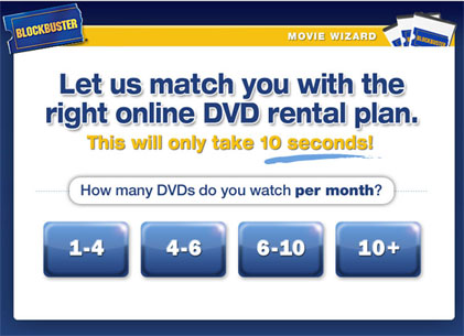 There are 30+ Blockbuster free trial offer affiliate landers on Google at any given time - Even I had one (it did poorly). Blockbuster was the hot offer of Q2 this year - everyone was launching a campaign around it. The offer paid out $32 - $52 per sign-up. While spying on competitors, I came across this stellar lander in late July and instantly got excited about the concept. This one set itself apart from the rest - I can’t say for certain of its’ earnings, but it was consistently on top of the ad pile.
The concept is simple yet brilliant - it’s what I dubbed the “Choose Your Own Adventure Lander” - and this is how it works:
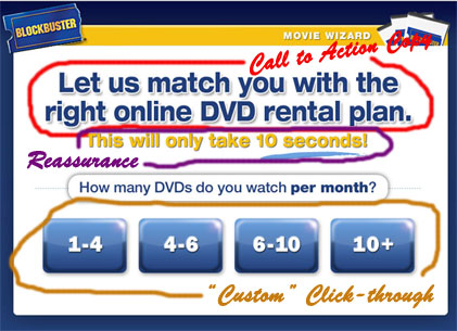
The first page of the lander contains a simple call to action headline “Let us match you with the right online DVD rental plan” - this statement is fantastic because there’s no obvious sell - it seems like this site is going to provide the visitor with a service - a site that wants to help - nice!
Following the clever headline is the tag “This will only take 10 seconds!” - hey, this site wants to provide me with a service and will do it quickly - wonderful!
Finally, the click-through - “How many DVDs do you watch per month?” - alright! This site is going to find me a DVD rental plan that’s tailored to MY needs - DY-NO-MITE! - you’ve got the visitor hooked.
I got out my crayons so I can break it down for ya:
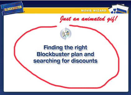
So - the visitor chooses the plan that works best for them - from there on it’s smoke and mirrors. A phony calculation page:
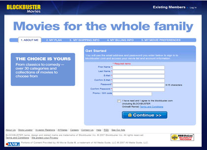
And a redirect to the Blockbuster Free 2 Week Trial $32.00 One Page CPA Offer - that’s right Virginia, any movie watching lifestyle you choose all go to same page:
Making it Work for Me
I LOVED the simple brilliance of this - you’re distracting the visitor from the sales pitch by offering them a service (well, faking that you’re offering a service). Not only are you distracting them, but you’re building likability too - the visitor is thinking “Hey, this site is here to help me” - the PERFECT storm for conversion.
So, I got to thinking about how this concept could be improved above - I immediately noticed that the site is a Quality Score nightmare. Almost zero text, no sub-pages, no movie or DVD relevance - to get those 5-cent clicks, there would have to be some work done to build a mini-site out of this idea.
I also noticed that the site looses control of the visitor after the first click - I set to develop a way to retain control throughout the entire process, even on the merchant page.
Finally, I didn’t think the site was interactive enough - what would happen if we led the visitor through 3-5 decisions instead of just one? - would we increase that likability and trust factor? - would we get their minds even further from the sale and distract them even more with a custom appeal?
First Test
I first attempted this concept with a site that was launched a couple of weeks earlier. It’s a site that we sell our own informational product on. We had four similar products for sale that sat on a single sales page (one of those loooooong ClickBank jokers) - I used the CYOA Lander approach to break up the four products into separate pages for each with an intro page that had a “lifestyle selection” - something like: What style of poker do you play most? (question) - Texas Hold’em, Short Hand, Heads Up, No Limit Hold’em (answers)
Within 24 hours sales increased by over 30% - visitors appreciated the custom direction and the tailored sales pages. Major success!
Overwhelming Evidence
If you haven’t gathered from my writing so far, I am a bit of a knucklehead - so, in true knucklehead fashion I put the CYOA Lander experiments on hold to work on other projects (which to my defense are fantastic projects) - I did nothing with the idea until mid-September when my affiliate manager from Azoogle alerted me to a great offer that screamed of a CYOA Lander approach.
I got into action and created a near perfect CYOA - a few questions to get the visitor in the mood to click around, mini-site with a couple of articles to help with QS and a design matching the merchant offer. The results were astounding!
$2,350.70 generated for ONE OFFER in ONE DAY! This was our biggest take from one offer in a day ever! All from the CYOA concept.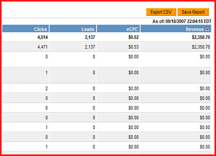
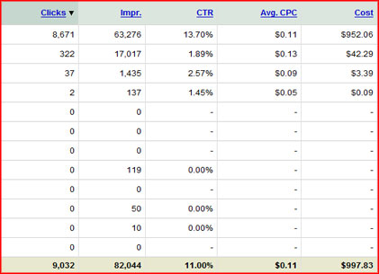
As you can see above we spent $997.83 in Google Adwords to drive the traffic (and and additional $75 with Yahoo) netting over $1,200! Wow - it REALLY works - and it keeps working. Of course we have amplified our efforts big time and have been doing numbers out of this world - in fact, we have a HUGE campaign on the horizon that is a variation of the CYOA Lander - I fully expect to break the one day record very soon.
CASE STUDY
I know - I know - you’re thinking “That’s cool and all RightStarter - we’re happy for you - but how can I get a piece of this action”. Well, I want you to get a piece too. The CYOA Lander concept can work for just about any product, offer, niche - I’m going to show you how to apply it in a real-time, real-world manner - Starting Friday, September 28th, I will be posting step-by-step directions and templates so you can apply this idea to your own campaigns.
I will also start a live campaign and share stats with you so you can get a better idea of how to implement and execute.
In the meantime, I highly recommend that you sign-up for a CPA program like Incent-a-Click, Copeac or Azoogle (my personal fav). This approach works best with leads based offers - Clickbank will work too, but I’m not a huge fan of selling ebooks so you’ll be on your own with Clickbank.
This entry was posted on Monday, September 24th, 2007 at 5:10 am and is filed under Case Study.
You can follow any responses to this entry through the RSS 2.0 feed.
Thanks for the info…looking forward to the case study!